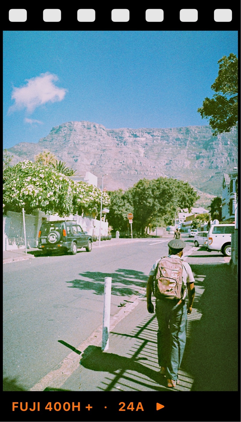
The short answer
A film photo and a filtered phone photo can look alike at a glance, but they get there in different ways. Film records light chemically, and its character comes from how it responds to that light: how it handles bright areas, how each colour layer reacts and how its grain forms. A typical filter takes a finished digital photo and changes its colours and contrast afterwards, often with grain laid on top.
That difference shows up in a few predictable places. Once you know where to look, you can tell most filtered photos from film, and you can make your own edits much more convincing.
Highlights: where most filters give themselves away
The biggest difference is in the brightest parts of the picture. Colour negative film is very forgiving of overexposure. A bright sky or a white shirt fades gently into white, and there is usually still some detail and colour near the top. This gentle fade is often called highlight roll-off. Kodak Portra 400 is loved for it: skin and skies stay soft even in hard sun.
A phone sensor behaves differently. When an area is too bright, it clips: detail stops suddenly and becomes flat white. Modern phones hide this well by blending several frames, but the result tends to look evenly bright from corner to corner. A filter applied on top cannot bring back detail that was never recorded, and many filters make it worse by adding contrast.
So if the sky in a 'film' photo has a hard edge where blue turns to pure white, or bright areas look flat and grey, that is usually a filter.
Colour: film shifts colour with the light
Colour film has separate layers that respond to red, green and blue light, and they do not respond in perfect step. As exposure changes, colours drift a little: shadows may lean green or cyan, highlights warm or cool, depending on the stock. Each film has its own drift, which is a big part of why Portra, Gold and Superia look different from each other.
Many filters apply the same colour change to the whole image regardless of brightness. That flattens the effect. A photo that is equally orange in the shadows and the highlights reads as tinted rather than filmic. Good film-inspired looks treat shadows, midtones and highlights differently, the way the film did.
Grain: structure, not noise
Film grain comes from the silver crystals and dye clouds that form the image. It is part of the picture, so it follows the tones: it is most visible in midtones and smooth areas like skies, and it changes with the film's speed. A 400 speed film has more visible grain than a 100 speed film, and black and white films such as Kodak Tri-X have a grain character of their own.
A cheap grain overlay is the same pattern laid evenly across everything, sometimes coloured, often too strong. It can look like a dirty screen rather than part of the photo. The fix is restraint: real grain at normal viewing size is subtle. Our guide to how much grain to add to a phone photo goes into the numbers.
Glow, imperfections and the frame
Some film stocks show halation: a soft red or orange glow around bright lights, caused by light bouncing back through the film. It only appears around strong light sources, such as street lamps, neon or sun through leaves. A filter that adds glow everywhere, or to a scene with no bright lights, looks wrong for that reason.
Dust, scratches and light leaks are similar. On film they are accidents, and they turn up now and then. When every photo in a set has the same leak in the same corner, it stops feeling like film and starts feeling like a template. Use these sparingly, and change them from photo to photo.
Frames and borders sit outside the image, so they cannot make a photo look like film on their own. They help when the photo underneath already looks right.
What a filter cannot copy
Some of what people love in film photos is not in the chemistry at all. A roll has 24 or 36 frames, so people shoot fewer, more considered pictures. They cannot check the result straight away, so they look harder before pressing the shutter. Many film cameras have fixed lenses and simple metering, which pushes people toward simple compositions.
No edit can add that. But you can borrow the habits: take fewer photos of each scene, think about the light first and choose one look for a whole set rather than a different filter for every frame.
How to make a phone edit closer to film
Start with the light. Photos taken in soft light, open shade or low sun take a film look far better than photos in harsh midday sun with blown highlights. If the sky is already clipped, no look will fix it.
Choose a look based on a real film stock rather than a generic warm or faded filter, so the colour shifts behave consistently. Then adjust in small steps: bring highlights down a little before adding contrast, keep grain modest and only add glow when there is a bright light source in the frame.
Finally, compare with the original. If the edited photo looks like a different scene, you have gone too far. The best film-inspired edits look like the moment you remember, not like an effect.
Try it in Simul
Simul Studio is a film camera and editor for iPhone and Android, with looks inspired by real film stocks from Kodak, Fujifilm, Ilford, Agfa and Polaroid. They are film-inspired recreations, not film. You can see the look live before you shoot, or apply it to photos already in your camera roll.
In the editor, separate controls for highlights, whites, temperature, grain and halation let you make the small, targeted changes described above, and texture overlays add burns, scratches, dust, light leaks or print texture when a photo calls for them. Start with a look, adjust a little, and keep the whole set consistent.