More control,
less waiting.
The first step toward making the phone feel less like a camera roll and more like a small darkroom.
Archive note: this is a historical release story built from Simul’s internal project record. The product captures on this page are authentic screens from the current Simul build, included as visual proof of the surfaces described; they are not presented as exact historical 1.1 screenshots.
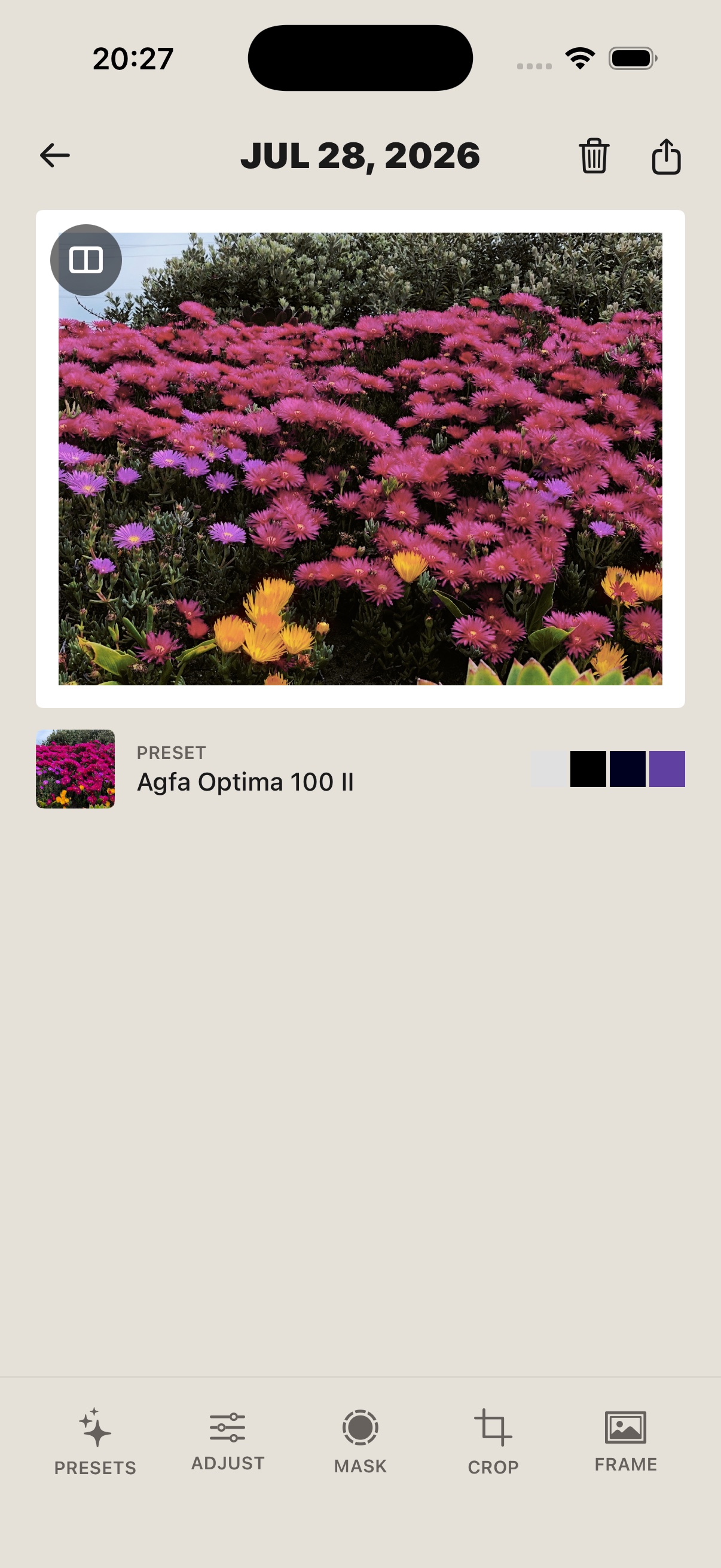
Simul started with a question: what if the phone could be a little more deliberate?
Not slower for the sake of being slow. Not buried under a technical workflow. Just a camera and editor that give you enough room to choose a direction before the image disappears into the rest of the library.
The first release established the idea. Simul 1.1 started working on the feeling of using it.
More control where the image needs it. Less waiting when you are exploring. A camera that can make use of the lenses already in the phone. An editor that feels like one place to work instead of a collection of unrelated sliders.
A calmer way to adjust a photograph
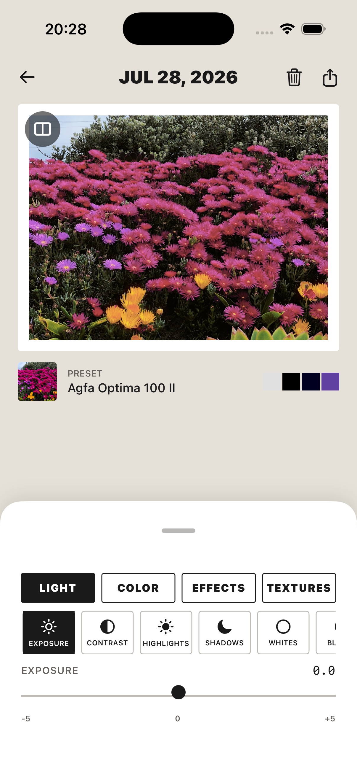
The editor now groups its controls into three clear sections:
- Light for exposure, contrast, highlights, shadows, whites, and blacks.
- Color for temperature, tint, vibrance, and saturation.
- Effects for clarity, sharpness, vignette, inversion, grain, and halation.
The point is not to make every control visible at once. It is to let you move through the edit in a sequence that makes sense: shape the light, find the colour, then decide how much physical surface the photograph needs.
That order matters. A preset is where the edit starts, not where it has to end. The image can still disagree with the first direction you chose.
Preview the idea before committing to it
Editing is exploratory. You need to be able to push a setting, see what it is doing, and decide whether the photograph wants more or less.
1.1 makes the preview path more deliberate. Interactive renders are kept to a manageable queue, so a run of slider changes does not become a pile of stale work competing to update the screen. The newest edit gets to win.
The editor also keeps an original comparison available while you work. It is a simple reminder that the first direction is only a direction, and that a photograph can change without losing the reason you took it.
Use the camera that is already in your phone
The camera experience now discovers the rear lenses available on the device and exposes them as a simple choice when more than one is present: Ultra Wide, Wide, or Telephoto, with the appropriate magnification.
That makes the choice part of the photograph rather than something you have to decide before opening Simul. A flower can have texture and depth. A street can stay wide. A portrait can feel closer without asking the edit to manufacture all of the separation afterwards.
On supported devices, the phone’s hardware capture control can also trigger the same camera path as the on-screen shutter. The camera does not need a second workflow just because your hand is on a physical button.
A darkroom that does not get in the way
The adjustment surface was also reorganised around a quieter interaction: focused sections, clearer tap targets, and controls that can be explored without fighting the image.
Masks and crop tools are treated as part of the same edit rather than a separate application inside the application. The controls stay close to the photograph, and the preview remains the place where you judge the result.
There is a practical reason for this. Simul is meant to bring the kind of work that used to happen across Lightroom and Photoshop onto the phone. That does not mean copying every desktop panel. It means keeping the important decisions close enough to the image that an idea can become an export while you are still in the moment.
The cloud should support the photograph, not hold it hostage
1.1 also laid the foundation for iCloud-backed sync while keeping the app usable when iCloud is unavailable.
The app checks whether an iCloud account is available before starting the sync engine. If it is not, Simul can remain open and useful instead of turning a cloud condition into a dead end.
That is the right boundary for a photo tool. Sync can make the library more durable, but the ability to make an image should not depend on a background service being in the mood to cooperate.
Why 1.1 mattered
The first version of a creative tool is often about proving that the idea can exist.
The next version is about whether it feels good enough to return to.
1.1 moved Simul in that direction. It made the editor more legible, the preview more responsive, and the camera more aware of the hardware in your hand. It began turning a set of film-inspired effects into a working process: start with a photograph, choose a direction, adjust the balance, and keep looking until the image feels like something you want to send.
The best first win is not understanding every control.
It is seeing an image you want to keep.