A more physical
edit.
Texture, framing, and a darkroom flow that gives the photograph somewhere to go.
Archive note: this is a historical release story built from Simul’s internal project record. The product captures on this page are authentic screens from the current Simul build, included as visual proof of the surfaces described; they are not presented as exact historical 1.2 screenshots.
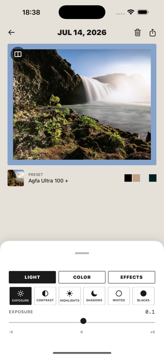
Colour can point an image in the direction of film.
It cannot carry the whole feeling by itself.
The part that makes a photograph feel physical often arrives later: a little grain, a dust mark, the uneven edge of a scan, a flare that catches the light, or a frame that gives the image a place to land when it is shared.
Simul 1.2 is where those surfaces became part of the edit rather than an afterthought.
Texture is not decoration
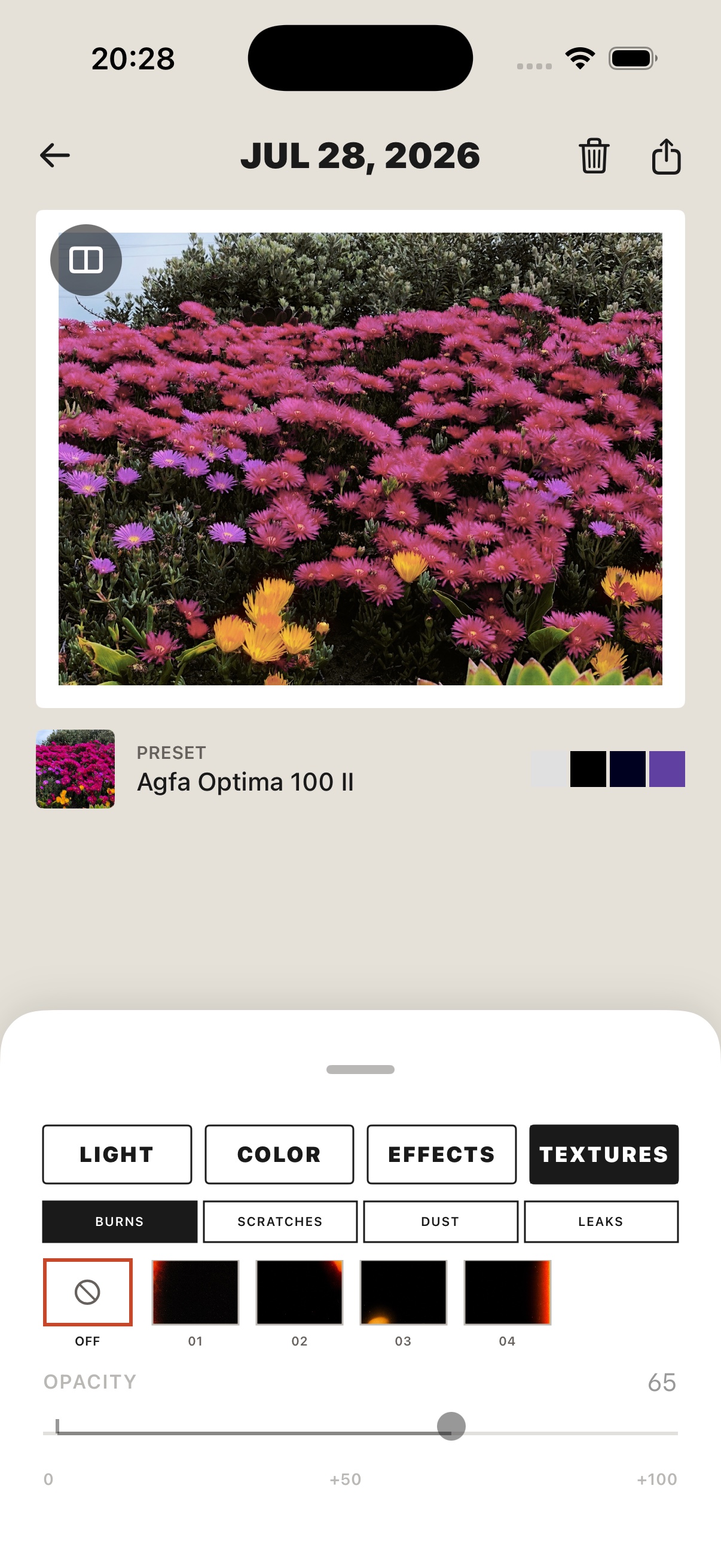
The Textures category gives the image four families of scanned-film treatments:
- Burns for light moving into the frame.
- Scratches for the marks and interruptions of a handled negative.
- Dust for the feeling of a scan rather than a perfectly clean digital file.
- Leaks for restrained colour entering from the edge.
Each family has several variants, and each texture has an opacity control. You can start with a treatment, see how it changes the surface, and pull it back when the photograph starts to look like the effect instead of the moment.
The textures are non-destructive. They can be changed or removed, and they stay part of the saved edit, export, and batch render rather than existing only as a temporary preview.
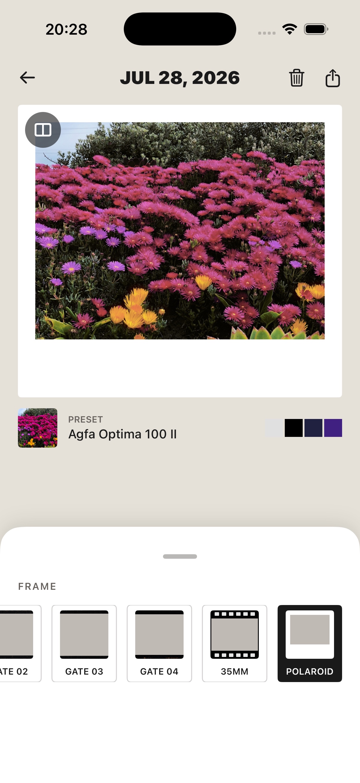
Frames give the image a context
The frame is a different decision from the texture.
Texture changes the surface of the photograph. A frame changes how the finished image is presented.
That is why the physical gates live in the Frame tool rather than being treated as another overlay. The image-backed gates are thin, edge-to-edge rebates with a transparent opening, so the photograph can keep its own crop while the perimeter carries a little worn film history.
The result should not feel like a heavy matte placed over every image. It should feel closer to a negative or a print that has arrived with its edges intact.
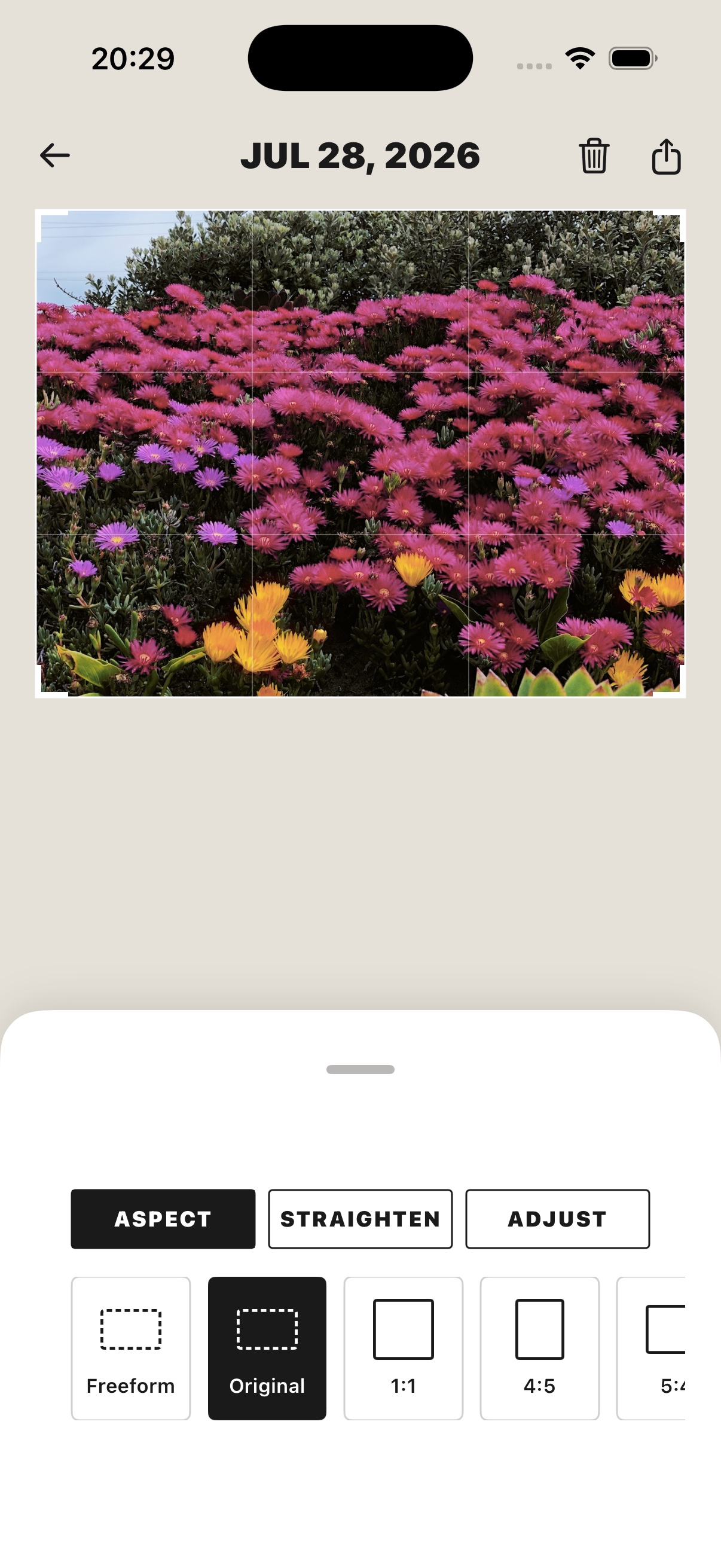
Crop the photograph you meant to crop
A crop tool is only useful if the result matches the decision you made on screen.
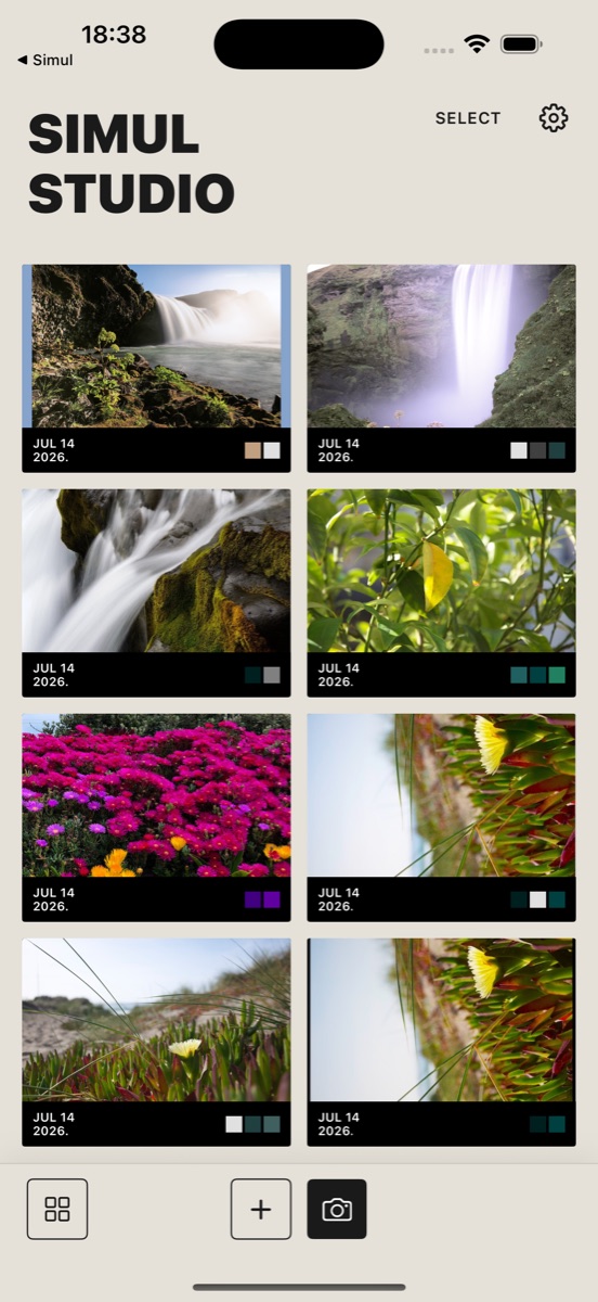
1.2 corrected the coordinate handoff between the crop selection and the image renderer. The crop editor works in a top-left coordinate system while the rendering pipeline works from the opposite vertical origin. The conversion now keeps those systems aligned.
In ordinary language: if you select the upper part of a waterfall, the exported image should keep the upper part of the waterfall.
That sounds obvious. It is also exactly the kind of detail that breaks trust when it is wrong.
The correction carries through preview, export, gallery re-renders, and batch renders, so the image stays consistent after it leaves the crop screen.
The darkroom gets a clearer rhythm
The roll reveal is designed to be watched one frame at a time, but the controls still need to be obvious.
After a frame develops, the navigator keeps the current image visible and gives you explicit PREV and NEXT controls. A grouped progress strip shows where you are in the roll without taking over the screen, and swipe paging remains available for people who prefer to move through the set by touch.
The current frame group is marked with the safelight red. The rest of the interface stays quiet so the reveal can do its job.
This is not about making the wait theatrical. It is about giving a roll a sequence. A set of photographs feels different when each frame arrives as part of something you chose to shoot together.
Settings should explain the deal plainly
The Settings surface was reworked into clearer cards with more readable labels, larger tap targets, and a compact export-quality selector.
The full-version action now says what it is: UNLOCK FOREVER. The purchase language keeps the one-time nature of the unlock beside the action rather than making you search for the important part. The early-release card also gives early supporters a visible thank-you instead of leaving an unlocked account feeling anonymous.
Support has a direct route too. Feedback can open a prefilled email to the Simul team without creating an in-app feedback database or asking for more personal data than the message someone chooses to send.
The product language is intentionally simple because the image is the interesting part. One purchase. No subscription. A clear export choice. A place to ask for help.
A more physical edit, without pretending to be analogue
Simul is not trying to turn a phone into a chemistry lab.
It is trying to give a digital photograph some of the qualities that make people care about film: a chosen direction, a little softness, a surface with history, and a final image that feels more like an object than a default camera output.
1.2 brought those decisions closer together. Choose the film direction. Adjust the light and colour. Add a surface if the image wants one. Use a frame if the photograph needs a context. Then move through the roll and see what you made.
The goal is not to make every image look worn.
The goal is to make the edit feel considered.